En Blanc
Category
Typography
/
/
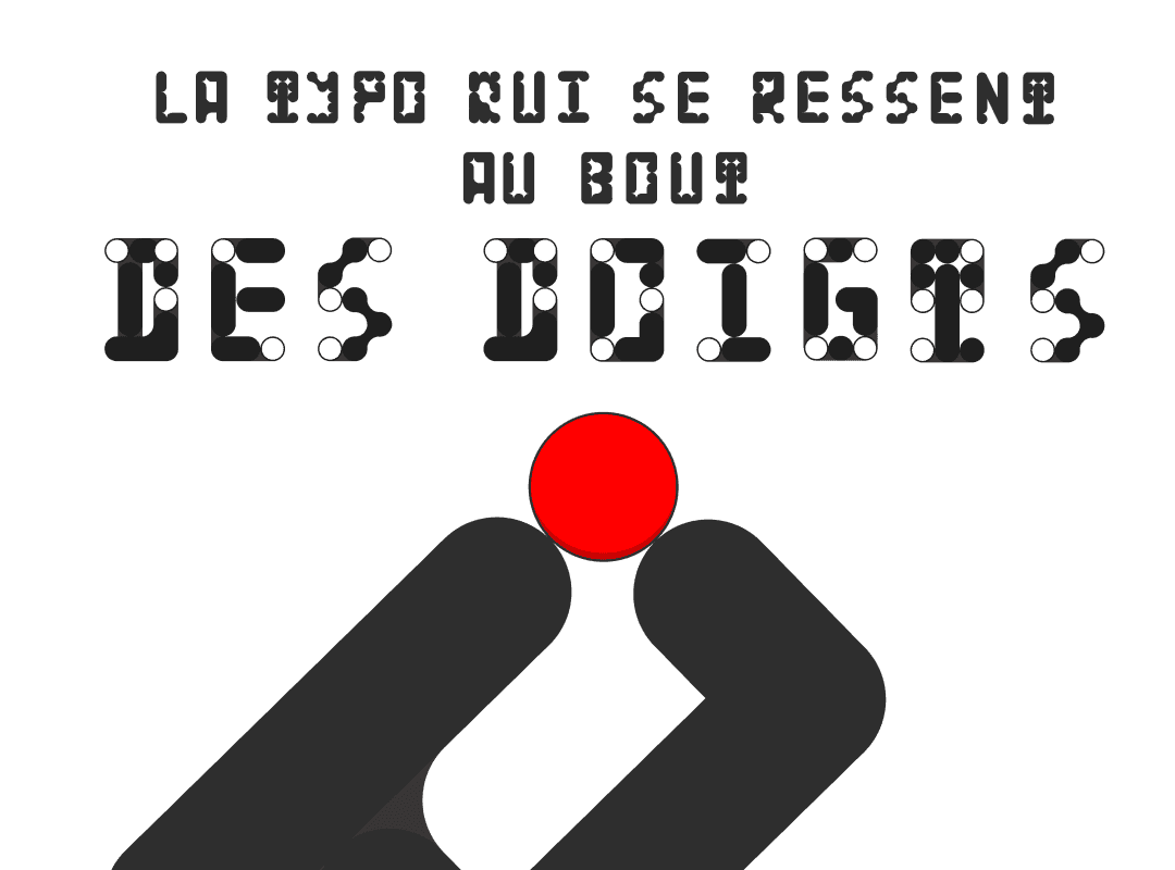
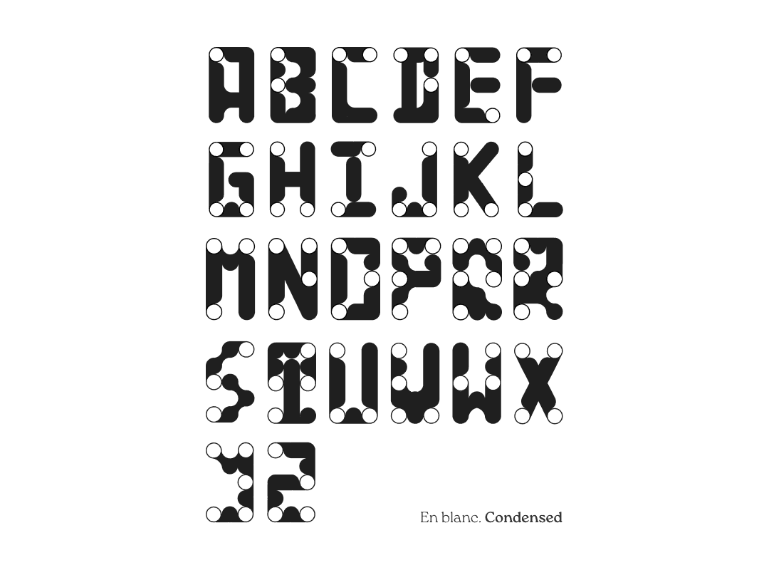
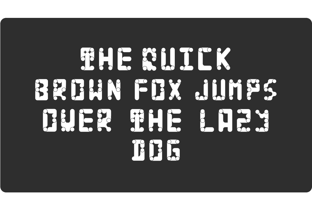
More than a Typo, a bridge between worlds

And why not let Everyone read between the lines?
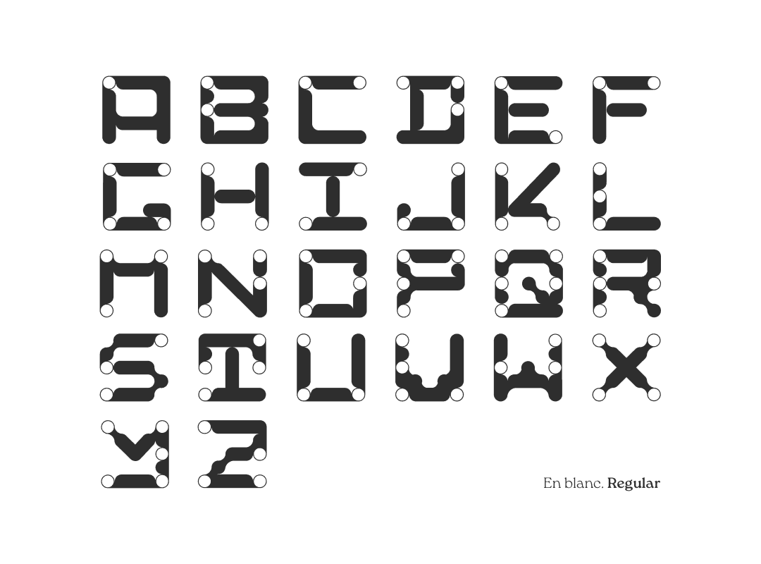
En Blanc was born from a simple question: what if an alphabet could be not only seen, but also felt?
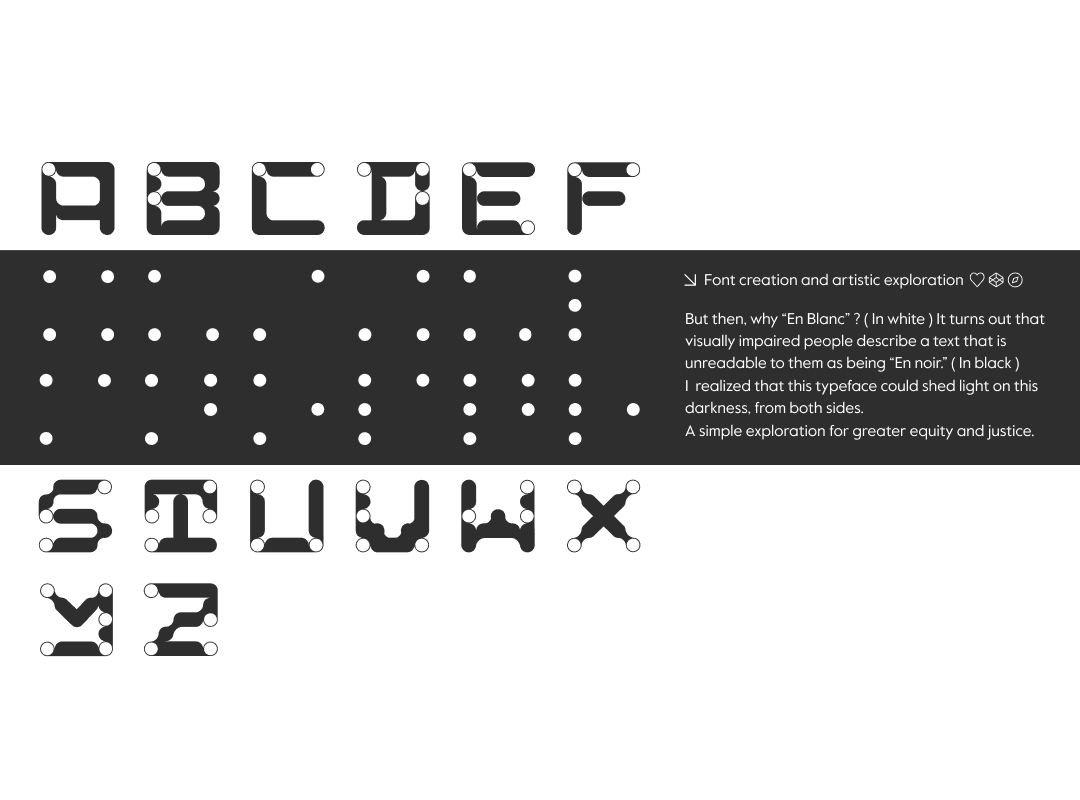
The idea came from the way visually impaired people describe a text they cannot read, they call it "en noir", in black. That struck me. So I started exploring what it would mean to create a typeface that lives in both worlds : One that merges Braille and the Latin alphabet into something new, something shared.
It was a personal project, with no client and no deadline. Just curiosity, and the quiet conviction that design can be a tool for equity. En Blanc wasn't about making something beautiful, it was about making something meaningful. And sometimes, that's the most honest kind of design there is.